
Product-minded Builder
Google Sheets, Apps Script, AI-assisted development
Workflow Optimization & Decision Support
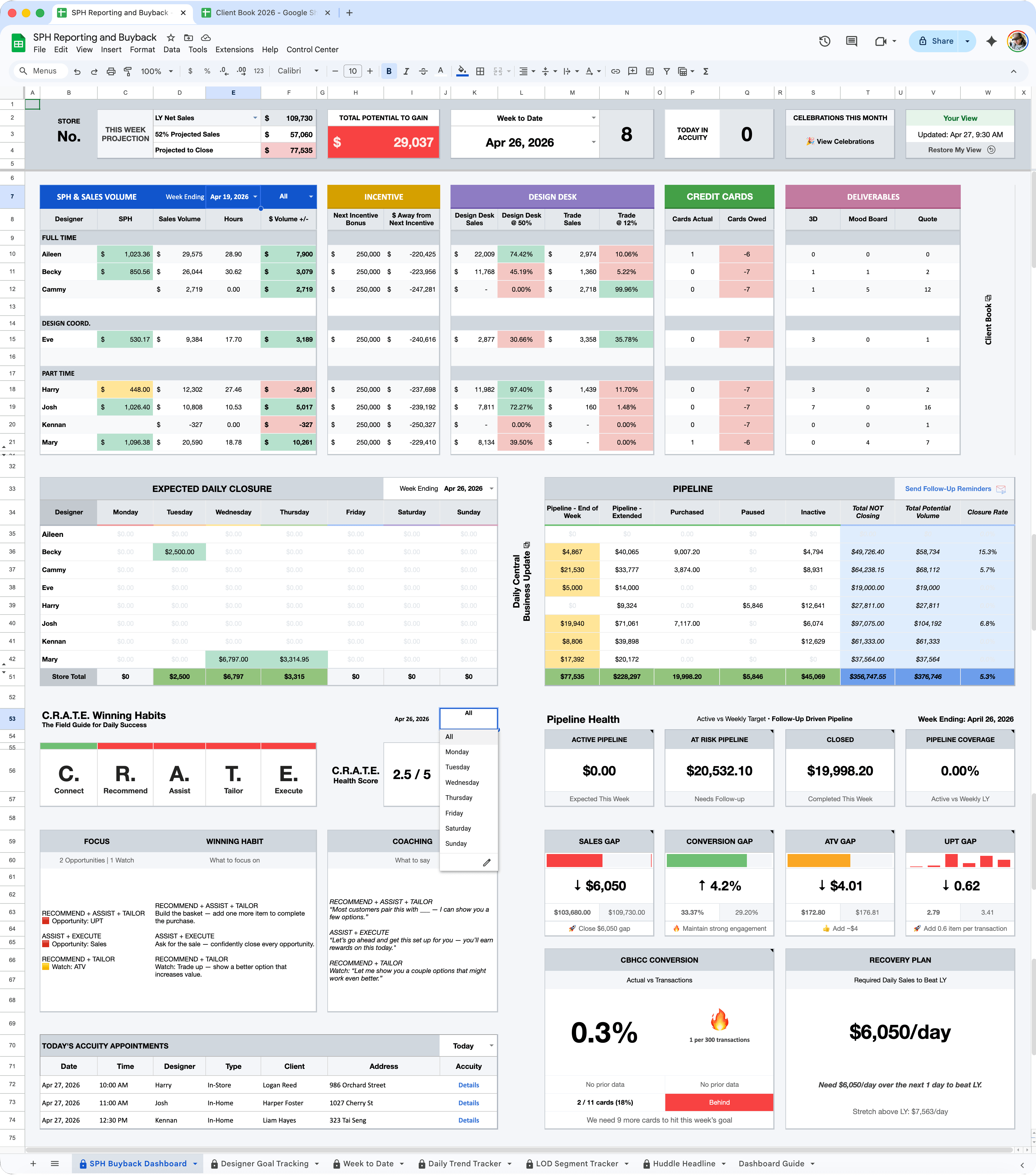
A centralized control layer that dynamically updates dashboard views, metrics, filters, and insights based on user-selected context.
Surfaces active opportunities, at-risk pipeline, expected closures, and follow-up priorities to help teams focus on the highest-impact actions.
Transforms KPI gaps into daily priorities, coaching prompts, and next-best actions.
Created a single source of truth for KPI performance, pipeline activity, and daily priorities.
Reduced repetitive tasks through dynamic formulas, scripts, and auto-updating views.
Surfaced performance gaps, revenue opportunities, and follow-up priorities in real time.
Turned complex data into clear actions that helped teams focus on what matters most.
01.
Convert KPI gaps into daily priorities, coaching actions, and winning habits.
02.
Surface revenue opportunities, at-risk pipeline, expected closures, and follow-ups.
03.
Automate repetitive reporting and dashboard updates to improve speed, accuracy, and focus.
04.
Use AI to accelerate prototyping, debugging, logic creation, and iteration of scalable internal tools.
How data becomes actionable insights inside the dashboard.
How leaders interact with the dashboard to identify priorities, coach behaviors, and improve outcomes.
01.
Reduced manual reporting time by 30–50%
02.
Consolidated 3+ data sources into one system
03.
To identify priorities and take action
04.
Enabled same-day visibility into performance gaps